|
 |
 |
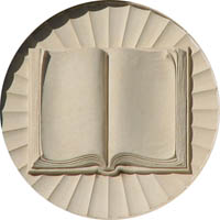
Laurie
Conrad's first book
|
See
the design & read
more about in the Books section of the Art Temple |
 |
archives |


|
|
|
Laurie
Conrad's first book
|
See
the design & read
more about in the Books section of the Art Temple |
|
archives |
A glimpse
into the process of designing Laurie Conrad's upcoming trilogy of books. |
 |
| August 2007 :: The Birth of a Book Cover |
The cliché "You can't judge
a book by its cover" was
surely the result of too many books being designed by people who should've stuck
with laying out ads for newspapers, not designing something as conceptually challenging
as a book cover. There's a lot at stake in a book's cover. Far beyond just being
a pretty picture and a nice font, the cover is an emotion-charged wrapper
that visually represents a condensation of the ideas within. It has the power
to make or break a book.
It's a well known fact in the publishing industry: a book cover can have a significant influence on a book's sales. A book cover is packaging, after all, and is, in a sense, the book's first chance to tantalize a potential reader. In the small space of a book's cover, the book's entire sensibility and spirit are projected. This makes a book cover a very powerful piece of persuasion. And any author who has a series of books and who uses one designer for them all (the Harry Potter books come to mind, and the Carlos Castaneda series) is also creating a brand for herself and her books. The cover is the key factor in this branding. As a designer, books are my specialty, and as an illustrator, book covers are my penchant. I like the steep challenge they pose as the initiating talisman for the entire book. This allows me to exercise an adept designer's most elevated skill: to be a visual interpreter of abstract ideas. To take an author's written words and condense their essence into visual images so that prospective readers glean a sense of the book's predominant mood is the holy grail of book cover art. My own favored goal in designing a cover can be summed up in one word: Magnetism. The cover must be magnetic enough to capture glances from its bookshelf nook– to capture and hold that glance long enough to spark the desire to pick up the book and open it. Here's how the cover of Realms of Light came into being: Sometimes, a cover has inauspicious beginnings, like when the author gives you a crumpled piece of Xerox paper with a photo on it that looks like it's been photocopied about fifteen times… and says, "This is the image I want on the cover." This is exactly what happened with Laurie Conrad's Realms of Light. I took one look at the pitiful reproduction she handed me, and my heart sank. "I'll need the original photo," I pleaded. But there was no original photo. So I was stuck with a very poor quality photo, xeroxed so many times that the image was posterized. To me, it was a reproduction that should never be used in print. Laurie, who can always be counted on for perspectives from alternate realities, said, "I knew it was perfect. Just the quality we needed for the basis of this cover. That horrid Xerox reminds me somewhat of the sort of vision I have had in some high mystical experiences, high states of waking state consciousness – almost like x-ray vision, or "negative" vision – and it is never a clear seeing, more dot-like… more like the Xerox. And I knew that you would find a way to make it all happen." So my only recourse was to use the decay as a deliberate creative effect. Most posterized imagery tends to come across with a Pop Art look, like an Andy Warhol portrait or a '60's era poster. But Realms of Light didn't fit that conceptual profile. The tone of the book's concept is mystical, playful and musing… and it has an integrity of voice that's timeless rather than contemporary. So I decided to give it the old-fashioned look of an etching, to utilize the textural, high contrasts in the photo. I colorized it in Photoshop, giving the monotone image a sepia tint and adding soft, subtle, late afternoon seaside colors which I applied with a Wacom tablet, using a wispy, loose hand that imitates delicate, oil-tinted vintage photographs. To my own surprise, it was a convincing transformation. My digital treatments somehow brought out the lyricism of the image, which I had not been able to see when I first looked at the photograph. It was important to me to tie the cover in with the interior design of the book. They had, after all, been designed quite separately, and quite some time apart. The production schedule had called for the cover to be designed during the period when the book's editing was in progress. This isn't ideal for the designer but it's often the sequence one faces in publishing: the cover has to be done before the interior design is begun. The resolution for visually uniting the exterior with the interior came like an unexpected guest: the graphic style of my interior cloud mastheads seemed potentially adaptable to the cover, since the image on the cover featured a large expanse of sky. The fact that I had taken an etching-like approach to both the cover image's bad Xerox photo, and since I had created the cloud mastheads on the book's interior to imitate small etchings, the mingling of cloud mastheads to the cover's skyscape turned out to be fortuitous, the element that tied together both the cover and the interior. Once the cover was complete, there were some curious details
that Laurie and I noticed. No matter how consciously a designer composes her
work, it seems as if inspiration can take a graceful hand in the process, delivering
the final piece with a few surprises sneaked in. Laurie wrote, "Did you
notice that your lines [of the light rays amid the clouds] go with the stripes
in my shirt? And it is perfect that the angles between them differ only so slightly.
And the clouds look almost like a lightning bolt." It stunned me that I
hadn't even noticed this consciously, while doing the cover design… that
the stripes of the shirt and the sky almost matched. I love the symbol this delivered
to us, affirming so beautifully the harmony within our project: as the stripes
of Laurie's shirt repeated the refrain of the sun's rays, Laurie and the rays
of light were merged together. The author became the realms of light that she
had written about in her book. No matter how small, an act of creation is always mysterious… even
a book |
 |
| July 2007 :: Expedition
Into the Interior: In Between the Covers of a Book's Design |
When I tell people I'm
a book designer, their first association with the idea of "design" and
books is the book's cover. It's the only thing about a book that's commonly thought
of as "designed." Not so, though! Even though it's
true that the cover sets the stage for the book, and creates its first impression
on potential readers, it's the book's interior that readers ultimately will have
the most involvement in. It's the part of the design that the designer spends
the most time on too. The average text-dominant book is a complex piece of design
engineering, primarily involving subtle considerations of spatial dynamics and
monochromatic contrasts. The first significant choice that must be made is the font style. There is no rule of thumb, no right or wrong approaches to choosing a good font for a book other than readability. But as I found out with Realms of Light, even readability was a matter of opinion, not a measurable component. Good designers use classic fonts, not decorative fonts, for blocks of text. Since some of the classic fonts are so prevalent, some of them have been slightly updated by typographic designers so that the classic look has more of a contemporary feel. This was the case with my font of first choice, Berkeley. It's a serif font with a lighter-weight, wider face than its relatives, Times Roman and Times' ancestor, Galliard. Berkeley is just more poetic, less industrial and pedantic, than Times and Galliard. And it was the same font I had used on Laurie's previous book, The Spiritual Life of Animals & Plants. But the author considered it unreadable. I was convinced that her opinion was the result of a very procrastinated visit to the optometrist to have her eyeglass lenses updated. Such an extreme difference of perception was alarming: to me and my designer colleagues, there was nothing unreadable about Berkeley. The author wanted a font featured in her favorite philosopher's book series, which she found decidedly readable. The font turned out to be Galliard. Printed on a page side by side, Berkeley and Galliard are almost identical. Galliard's a little heavier, which persuaded the author of its greater readability. Such a difference of perceptions proves once again that there is no right or wrong in art: what's good or bad is truly in the eye of the beholder. So, Laurie bought Galliard for me, and the project could then move on. I chose five weights of the Galliard family: regular, italic, bold, bold italic and black. These really are the minimum one would want to start a big project like a book with. Another factor that had bearing on these choices was line spacing, or leading: the width between the lines of type. I was in favor of more, the author was in favor of less. In the end, the choice was for less, because it meant more words could go onto a page, and this was a long book, with price increases in ratio to its length. As a self-published book, it was important to take the author's expenses into consideration, and even incremental design choices like line spacing could have impacted her book's cost of printing. The next critical choice to be made was margin widths on all four sides of a page. Once again, the practical choice was for less, not more, in order to help keep the book to a reasonable length. Wide margins are useful for short books that need more length. Naturally, a designer wants wider margins because white space lends elegance to a design. The margin widths on this book aren't generous, nor are they too skimpy --they're just ordinary, and as such, not a noticeable enhancement to the design. Again, this was not a choice made on the basic of aesthetics, but because the book's length was an issue. Simple, pedestrian margins prevailed. After these basic elements were chosen, then the real work of the design could begin in earnest. Early on, I had come up with the defining graphic element, the cloud masthead. This graphic theme allowed me to establish a visual refrain of the book's title, Realms of Light. The graphic's style, imitating fine-lined, old-fashioned etchings, would reproduce well in the low grade copy machines used by our appointed on-demand publisher. And it was an easily variable graphic theme that I could generate many versions of, to use on the book's numerous intro pages, section pages and title pages. While they give the impression of older, small etchings, they have almost a futuristic slant: etchings for your space station's boudoir, perhaps? The effect of these basic design elements: the classic font, the conservative margins and line spacing, and a poetic adaptation of old-style etchings produced the overall effect of a classic book design with an elegant contemporary twist. Once these elements are established, all that remains is to fill up what seems like endless pages with formatted text and titles. It's as tedious as illustrating manuscripts in medieval monasteries, which I presume I have spent my share of past lifetimes doing! |
| June 2007 :: The Importance of Intro Pages |
The introductory
pages of a book set the tone for the entire book, in regard to both the
writing and design. Laurie Conrad loves extensive introductory pages – there
are TEN of them in Realms of Light. Though at one time in the history of
book authoring, when the use of several introductory pages was in high vogue,
it is very unusual for this century. Well-designed introductory pages, using graphics,
not just text, can add distinctive character to a book. That's why I'm approaching
the task of designing these introductory pages as an opportunity to not only
present the
concepts that the book is based on, but also as an opportunity to introduce the
design of the book. Realms of Light has: a title page, four pages of Table of
Contents, a Preface, a Frontispiece and a two-page Introduction. It also has
four section title pages and an Epilogue. This means my work is really cut out
for me. The intro pages have to be designed as decorative heralds of the
book's main body. They will strike the visual chord of the emotional tone
of the book. That's why they're so important to the designer, and why so much
effort is put into them. A downloadable copy of these intro pages, along with
the first chapter of the book, can be accessed HERE. |
 |
| Visual Literacy :: Through a Designer's Eye |
There is MORE
that goes into design than the scientifically measurable aspects on the page.
There is also a psychological component that is indiscernible to non-designers,
yet which dynamically affects the overall emotional impact of the book on its
readers. Like a composer who is trained to elicit subtle emotional responses
through the notes in a musical score, a designer uses her tools, like font size,
line spacing, margins and white space, to subliminally influence a viewer. Like
musicians, a designer has no words to describe the intuitive way she arranges
space so that a reader will experience a certain feeling from the work.
Teaching graphic design to college students, after a lifelong
career as a designer, has taught me how hard it is to convey the more instinctive
side of design: how to see the world and turn it into visual information that
will be magnetic enough to entice someone to read it. No matter how much training
is given in the basics of design, the more innate instincts for good design cannot
be grasped by software alone. The Old School modes of teaching composition, Despite being surrounded by such a non-stop
tidal wave of visual stimulai, the average person is, shockingly, downright visually
illiterate. The assault of images and messages in our culture haven't really
made us any more savvy about WHY these images and messages affect us so strongly.
This implies that there's far more power in graphic design than is generally
realized. We're still looked at as commercial decorators, just the people who
assemble the visuals for the marketplace of consumers. That's one of the reasons
why desktop publishing software has almost destroyed our profession (as well
as increased the efficiency of its production): because now, people who aren't
designers but who are willing to learn the software can produce their own graphics.
And since everyone thinks that their own taste in art is GOOD taste, they're
perfectly happy with what they themselves produce. This is because they don't
really know that there are strategies underlying the work of professional designers,
strategies that aren't teachable in software classes or manuals. To learn these
more subtle aspects of design, one has to study art, psychology and geometry
for utilizing classic spatial ratios like The Golden Mean and The Rule of Thirds. White space too plays a huge role in this. Like the rhythmic silent pauses in music, white space on a page or screen design offers the eye a resting place, a quiet counterpoint within the body of information and imagery. There's something mysterious about the use of white space that can make a design look elegant and graceful. Without effective white space integrated into a design, the effect is usually busy and crowded, not inviting to the eye. This clogs the information, makes it harder to access, which defeats the whole purpose of graphic design: to entice attention by capturing someone's eye. |
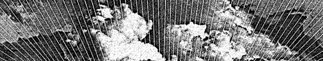 |
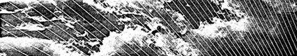
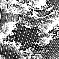
| Cloud Masthead from REALMS OF LIGHT |
| This is one of the series of cloud mastheads I'm crafting as the primary design ornaments of Realms of Light. They are photos of cloud patterns, converted to this old engraving style by the use of posterization and etching filters in Photoshop. May 2007 :: Project Outline My efforts will be focused primarily on an overall design and ornamentation of this book. The specific tasks of this design and illustration project will involve developing the artistic and technical aspects of :: -- page layouts |
| March
2007 :: Project Introduction I'm now in production, after having acclimatized myself to the many flaming hoops to be jumped through. It's a juggling act now, producing these books while teaching college, staying firmly on the cutting edge as a designer & multimedia producer, along with the basics of living a fairly well organized life in a big city. Doing all this at once feels like trying to keep frogs in a wheelbarrow. They just keep jumping out and I have to keep chasing the slippery little scamps down and tossing them back in. But I think I'm starting to get the rhythm. It's exciting, faster than I'm used to, though with all the frogs to keep track of, each task takes a little longer just by virtue of there being MORE tasks in motion. DESIGN, AN INTERPRETIVE DANCE Doing this channeling for someone you know really well, for someone you hold in very high regard, whose work is charged with the highest consciousness, carries an imperative of no small weight. At the same time, it's a perfect challenge, because our experience together as meditators, friends, collaborators, and soul companions on the Path gives me an intuitive access to Laurie that I don't get from other people I design for. CAPTURING THE VISION Now at hand is the design of Realms of Light. It's a much longer manuscript and a far more serious one than The Spiritual Life of Animals & Plants. It doesn't fit into a storybook look. Though there are a few stories about animals, most of its stories are about people, so this gives the book a weighted, more pensive tone. It's still ethereal, though, and that's the fusion I'm trying to forge in the visuals. Once the vision is captured, it's a walk in the park. And I believe that I'm just a few pixels away from that capture. The task is to establish a visual theme based on a series of illustrated ornaments. Despite my intentions to use variations on the ornaments I created for The Spiritual Life of Animals & Plants, the vining plant borders and plant and animal icons just don't work with this book's thematic tone. However, what I'm finding out is that clouds DO. With a title like Realms of Light the feeling being reached for in the manuscript is lofty and uplifted, not really earthy. So I'm creating some etching-styled cloud images that fit into the chapter title pages like mastheads. They have a sense of radiant lightness and upliftedness that I can't get from plant forms. |
|
|
![]()
![]()
![]()
![]()
![]()
![]()
![]()
![]()
![]()